
EFFICIENTLY DRIVE BUSINESS
Featured Footwear Design
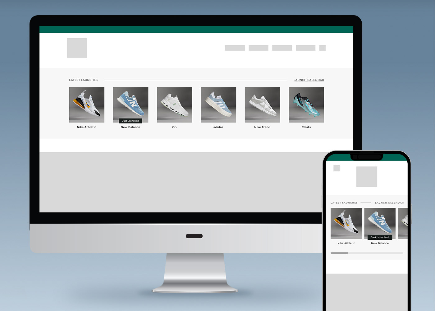
Overview: The goal of this project was to explore a homepage solution that showcases multiple footwear launches & highlights best-selling footwear programs to maximize sales during footwear's busiest retail season: back-to-school.
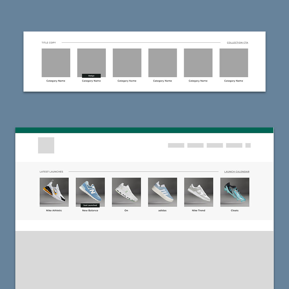
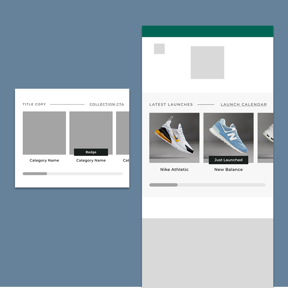
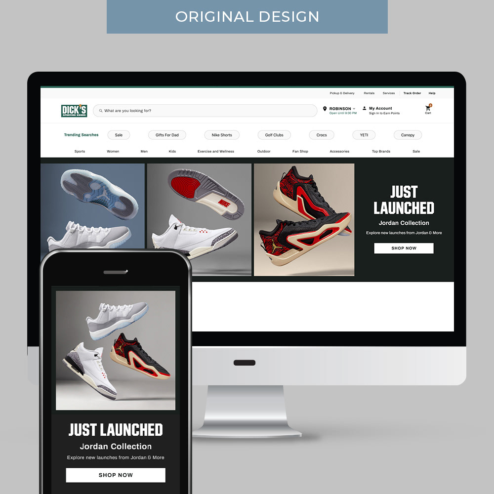
User Research & Design: Real-estate on the homepage is tight; so in creating an additional component, it was vital that it be efficient in space while serving as an interactive experience that performs. Also, in creating a new component, it was important that this be a flexible template with the ability to use across other categories & brands seamlessly. After competitive research & iterations, I landed on a design that features up to six different footwear programs & launches, links for each & a total collection CTA – as well as badges to highlight additional messaging. On desktop, all six featured shoes are visible, while on mobile the user can swipe to shop all options.
Results: This featured footwear component was launched as part of the Back-to-School campaign, but continues to be used long past August 2023. In the first two weeks following go-live, this component accounted for 40% of click-thru rates across the entire homepage. It continues to produce similarly strong ratings in engagement & conversion, earning priority placement on homepage. This component also performs exceedingly well in supporting other category and brand storytelling on homepage and across landing pages.
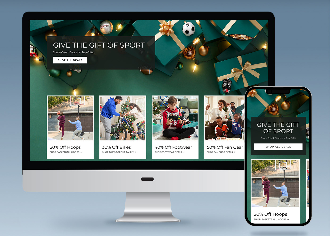
IMPROVE STORYTELLING
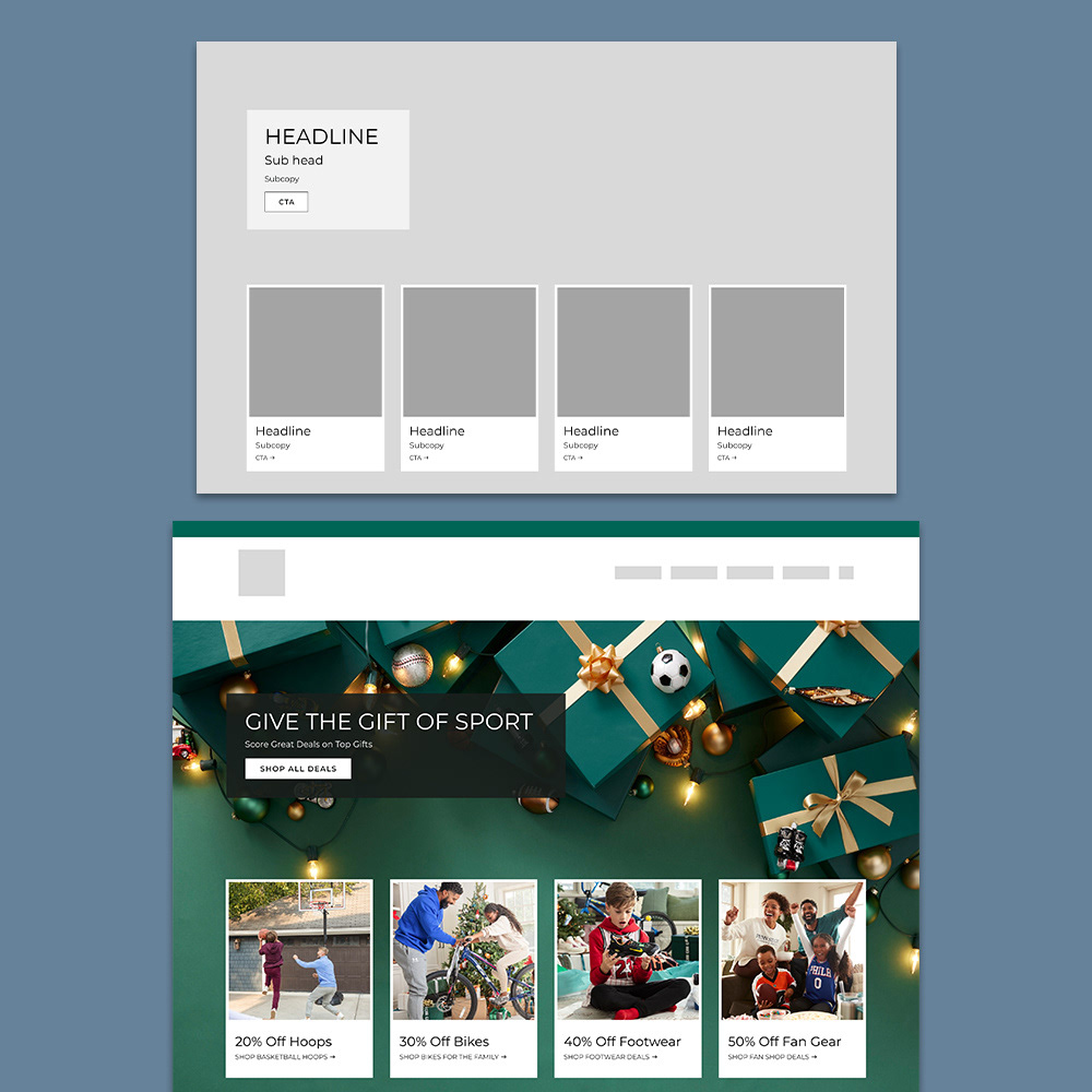
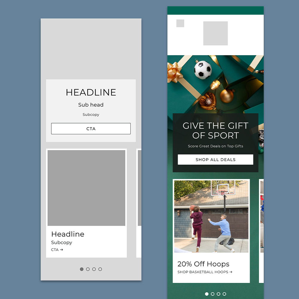
Hero Story Design
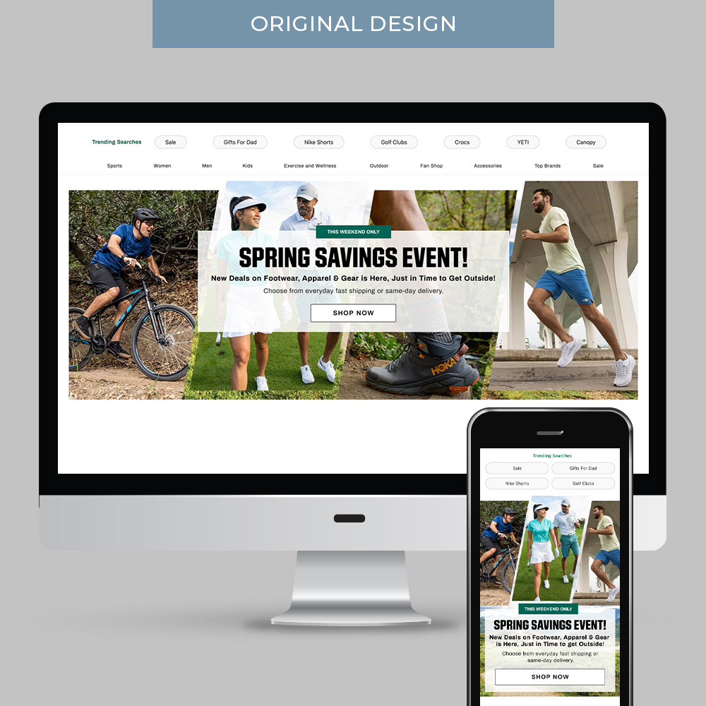
Overview: This component was designed as a solution for showcasing multiple sub-stories within an overarching message – ultimately replacing the carousel component in engagement & conversion.
User Research & Design: The original design served as an overall sale message with images speaking to categories that were on sale. It felt tight & the message vague as to what this single Shop Now CTA was speaking to. I wanted to create a solution that could elaborate on key stories within the overall sale message to showcase categories included in the sale – a sentiment from user testing. I landed on a final design that tells those extra stories within cards that include specific CTAs for more efficient site navigation for the customer interested in a specific deal or all deals. In creating this component, it was important that it be a flexible template with the ability to tell a variety of stories to serve the current retail needs. To deliver on that goal, there are variants in text box location & color, as well as number & style of cards.
Results: This hero component was launched as part of the Holiday campaign. In the month following go-live, this component accounted for 30% of click-thru rates across the entire homepage. Ultimately leading the page, this hero design continues to drive consistent revenue on the homepage by showcasing a cohesive, clean story for the customer to browse. It continues to produce strong ratings in engagement & conversion.